
Taming Obdurate Orchids
A glimpse into overcoming some of the challenges of making pictures of orchids, the Fujifilm GFX 100S and a bonus bit about sensor crookedness
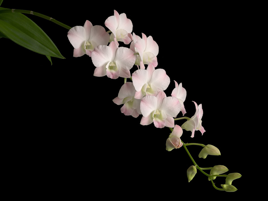
Dendrobium Airey Peach, 2023. Photograph notes: Sony a7R II with SMC Pentax-A 645 120mm F/4 Macro, natural daylight illumination, F11, 51 focus-bracketed exposures, raws processed in RawTherapee using custom made camera profile, blended in Helicon Focus.
Contents
For the Sake of Orchids
Surprising Challenges of Photographing Orchids
Some thoughts about the Fujifilm GFX 100S
An Even Better Sensor Crookedness Ruler
For the Sake of Orchids
Over the past two years, I’ve immersed myself in making pictures of orchids. What started out as a mere favour has blossomed into a keen interest in making as good a picture of these flowers as I know how, combining all that I have learned over the past two decades or so.
These orchids are no ordinary flora, I soon came to realise. As any keen eye will be able to discern good from great photographs, like fine wine and food from the ordinary, so too would orchid aficionados pore endlessly over what makes a particular orchid plant quite special to them. There are also strict judging standards that have stood for a long time. I’m no expert on this, not even close, but I gather that the flower’s shape and form generally take precedence, just as how the body shape of nishikigoi is the most important judging criteria. Size is also important, as are the presentation of colour and pattern and poise. The number of blooms in an inflorescence can impress or disappoint, as do the total number of inflorescences. The overall health of the plant matters. While the leaves are the easiest to observe, I have come to understand it is by the roots that you truly know a plant’s vitality. Oh, and forget not the fragrances that some exquisite ones exude. There’s no accounting for taste for that one!
While Nature has blessed us with an astonishing variety of orchid species, the Orchidaceae family being the most diverse in the plant kingdom, many, many more have been created though the loving, caring hands of humans. These man-made hybrids, as they are known, are the endeavours of orchidists attempting to create ever more robust, colourful and fascinating possibilities than would otherwise take the great Mother Nature eons to chance upon, or perhaps never. Some crosses are virtually impossible unless by ridiculous happenstance, because the pollinators are the wrong shape for both parent flowers (many orchids have evolved to fool a specific species of pollinator by either producing their pheromones or mimicking the form of the female) or the parents don’t occur geographically close enough. I believe I’ve seen a number of intergeneric hybrids that combined as many as six or seven different genera. That’s never going to be a product of Nature.
Just think about the millions of attempts at making new hybrids for over a century, over a hundred thousand officially registered ones with the Royal Horticultural Society, and many more unregistered, sitting pretty in people’s gardens all around the world. An endless flow of variety continues to entertain for many lifetimes, while many have been invariably lost to time. Those rare hybrids are often not collected today, mostly because they are not easily available on the market. For those who care, they are precious and to be closely guarded. I have been fortunate to be able to photograph some of these orchids.
Being privy to the hunt for these rare heritage plants revealed to me that basically all photographic documentation of them is very poor. Most are blurry, sometimes mislabeled, low-resolution or even just black-and-white film. When there is colour, it is always inaccurate, sometimes to an extraordinary degree. An orchidist can be unusually particular about flower colour, but when accompanied by a photographer and printmaker who has made it his business to be extremely fussy about colours, the two can really go nuts splitting hairs on this topic. You have no idea how many poorly taken photographs have complicated our research and ruined decisions, and so served as my primary motivation to discontinue this lineage.
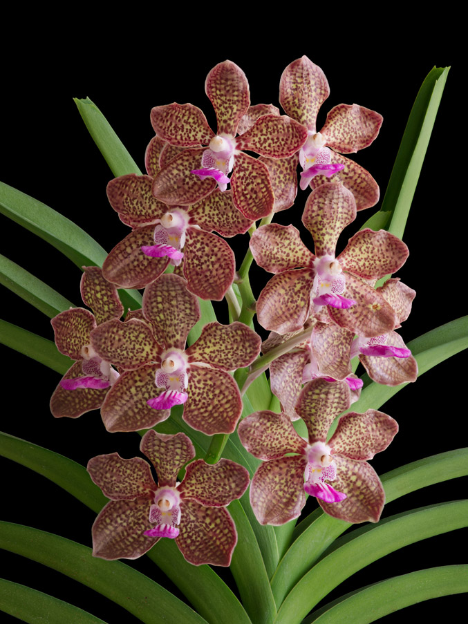
Pink Mimi Palmer, 11 flowers, 2023. This image was selected for the central exhibition display at the 14th Asia Pacific Orchid Conference, held for the first time in Singapore, 16-20 Aug 2023 at the Singapore EXPO.
Surprising Challenges of Photographing Orchids
Depth of field, or the lack thereof, is the chief enemy of an orchid photographer. Very simply put, it refers to the region of stuff that is considered to be in focus. Anything in front of or behind this region would be out of focus and hence details would get progressively more blurry, until they are so far out of the depth of field that they are unrecognisable.
Prior to the advent of digital image processing, large format camera users might attempt to work their way around this by employing camera movements of swing and tilt, based on their understanding of the Scheimpflug principle, distributing the plane of focus as optimally as possible. But mostly we would try to stop down the aperture of our lenses as far as it would allow, barring sharpness-robbing diffraction. This too has limitations on how much depth of field you can gain, which unfortunately is also greatly reduced by the inherently lower depth of field of the larger image format, yet the latter is usually desired for superior image quality. Ah, conundrums!
The subject matter is just too thick and the optical system’s depth of field will not adequately cover it. I’m often working with a range of sharp focus of just several millimeters to centimeters despite being at f/11. F/16 results in too much diffraction and f/8 is almost unmanageably too shallow, so f/11 is better for giving me some margin of error, and I did check to confirm I was not getting too robbed by diffraction.
The almost four-decades-old optical design of the SMC Pentax-A 645 120mm F4 Macro lens isn’t the best by modern optical standards, but it is highly even in resolution across a wide image circle, has very low falloff, virtually zero distortion and seemingly more resistant to losses from diffraction. The older, softer, more painterly rendering lenses tend to be that way versus modern, biting-sharp-from-wide-open, diffraction-limited designs. Fujifilm’s native GF 120mm is much sharper at wider apertures, but falls off rapidly after f/8 and only goes up to 0.5X magnification, where (surprisingly) the optical performance begins to dip a little. Jim Kasson tested it extensively with extension tubes and it does not fare well at 1:1 scale. And it’s too expensive in this part of the world.
I did have a special chance to play around with a copy of the legendary Voigtlander SL 125mm F2.5 APO-Lanthar macro. It was insanely good, as expected. The focus throw of something like 700 degrees is just ridiculously awesome, very smooth and much more rigid, despite being almost as old as my Pentax. It was only meant to cover 35mm format, but I was moving to even larger sensors and this copy had some centering issues. Otherwise it would have been highly desirable! It exhibits a small amount of distortion but the focus plane was by far the flattest and straightest I’ve ever seen.
I’m confused by the sheer number of Mamiya medium format lenses, but I did see one review of an APO design that demonstrated far less LoCA than my Pentax. It was unclear whether the resolution and field curvature are at least as good. Could be a worthy contender. My copy of the Pentax is very flat field, but don’t assume it must always be that way. A friend’s copy was noticeably curved, enough to make it not good for copy work. My 120A is slightly tilted and swung, and unfortunately, these Pentax-A 645 A lenses, I’m told on good authority, have no leeway in their optomechanical construction to afford the insertion of shims to correct this. I do have the option of shimming my adapter to take up the lens’ errors, but since I’m performing focus stacking, it’s quite irrelevant for now.
Nowadays, we have software like Helicon Focus and Zerene Stacker than can take in a sequence of photographs, each focused slightly differently in increments from the nearest object in the scene to the furthest, and combine them to make a final rendering that is entirely in focus everywhere. This is colloquially known as ‘focus stacking’, though I much prefer the expression ‘focus blending’, just as we call it “exposure blending”.
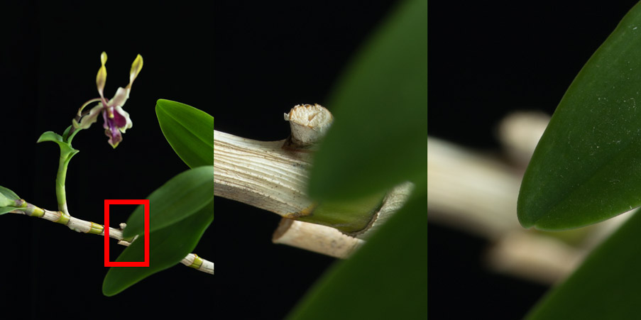
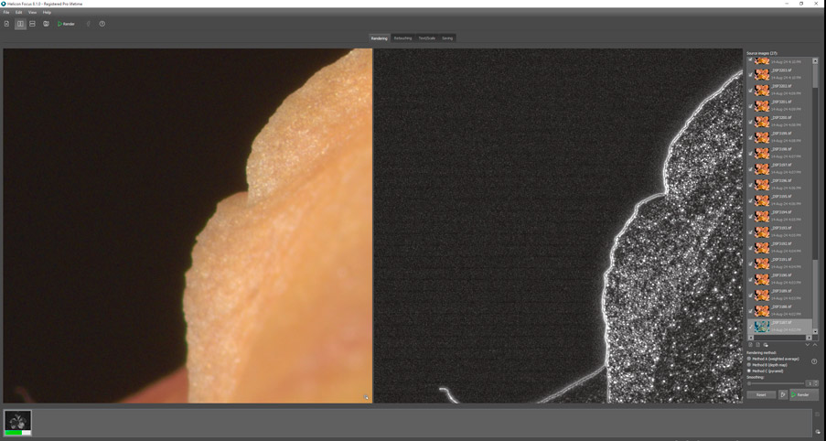
This example gives an impression of how bad the depth of field problem is, and how difficult it would be to resolve the grossly out-of-focus edges that overlap regions that are in sharp focus. Left shows the entire frame indicating the area of interest, center and right are crops from exposures with different focus, both shot at f/11.
My favourite of the two is Helicon. Zerene’s UI is simply too awful for a visual person like myself to deal with, and the last time (it was a very long time ago, don’t quote me) I tested both, Zerene was not coded to take advantage of GPU processing and was thus quite a lot slower in many tasks, including manual retouching where the brush would not glide smoothly as I dragged it around the screen. Before I got deeper into the weeds, I did find a rather thorough review by a serious macro photographer and came to the conclusion that Helicon still produces fewer artifacts from the stacking process than Zerene, based on my past experiences and the samples shown in the article, despite the author coming to the exact opposite conclusion.
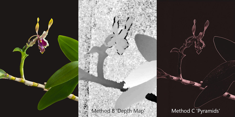
This comparison shows the ‘depth map’ masks used by Method B, which are somewhat nebulous and vague in selecting the sharpest regions from each focus-bracketed exposure, and its imprecision relative to Method C’s pyramids where the GUI’s visualisation shows very sharp and clean reconstruction of edges across the entire frame
There are different ways the focus-bracketed images can be blended together. Helicon Focus’ Method C (which is Zerene’s P Map) is useful for this kind of photography, where there are many intersecting occlusions at relatively great distances to each other, i.e. there is stuff crossing over other stuff located further away, and the depth of field is so narrow that if the stuff at the back are in focus, the stuff in front would just be a big blurry blob. Previously, I would only use Method B (Zerene’s D Map) for my landscapes, where naturally, significant regions of a given scene are entirely in focus, and thus this method works better. It locates the sharpest pixels, then uses a mask (called a ‘depth map’) to reveal them in the final rendering. But when you have lots of intersecting edges at (relatively) hugely different distances, you will find artifacts from the stacking process at these edges, where it is simply impossible to fully resolve discrepancies.
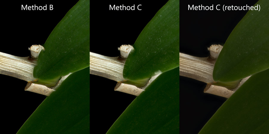
This challenging example is not dealt with perfectly by either Method B or C, but the edges are more cleanly defined for the latter and there is a little less of a blur halo around the leaf’s edge.
I like Method C for how it is able to render detail closer to the overlapping edge better than Method B, leaving less of a halo of blur. The example below reveals this difference much more clearly. Unfortunately, Method C comes at a cost of tonal and colour shifts at these edges, which gets worse if the luminance contrast at the edges is higher, and also generates some unwanted glare-like effect. There is no straightforward way to deal with all the issues of focus stacking with a single button press.
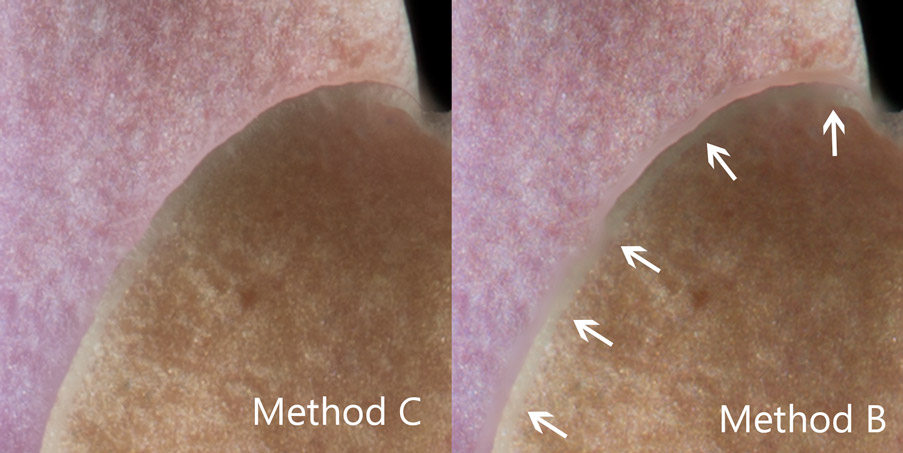
Method B has a halo of blur along overlapping edges which Method C tends to minimise.
I won’t claim to fully understand how Method C’s pyramids work and haven’t yet found an easy-to-understand explanation in my earlier research, but as a sign of the times, I asked A.I. to help me out. It went pretty well! The longer, more interesting version is a way better explanation but beyond the scope of this article, and anyway anyone can prompt A.I. themselves and get these answers instantly. Here is the simple summary from Gemini:
Pyramids in image processing are multi-scale representations used in focus stacking to enable efficient alignment and blending. By representing images at various resolutions, pyramids facilitate coarse-to-fine alignment and feature matching, reducing computational complexity and improving robustness. Laplacian pyramid blending further enhances the quality of the final image by preserving fine details and avoiding artifacts. This hierarchical approach makes pyramids a valuable tool for creating high-resolution images with deep depth of field. Method B is a simpler approach well-suited for smoother scenes, while Method C is a more robust option for complex images with overlapping elements and intricate details. The optimal method for a given image often requires experimentation and consideration of the specific characteristics of the scene.
The second big problem is the reproduction of colour. This is a field of study I had already spent many years delving into, and revisited in greater specificity in 2022. I felt a need to improve after noticing issues I had with poor reproduction of deep blue flower colours (interestingly not a colour that features in any orchid) which coincided with the simultaneous serendipitous publication of the most maniacal and detailed approach to accurate colour reproduction, by an artist, I’ve ever seen.
The primary control for this is the manufacture of my own very carefully made camera profiles, applied through a well-constructed raw developer (RawTherapee) that allows for all the right controls and none of the awful behind-your-back undesirable processing. The purpose of this article is not to teach how I make these camera profiles, (it would then be twenty times longer) but I will say that I have invested greatly in trying to understand how to best build them and have arrived at my own unique concoctions. Many tests and comparisons between the industry’s top three profile building softwares were made, as well as against professionally-built profiles that promise accuracy and are popular among photographers, and I have yet to find something which surpasses what I have. I’m still learning though, and will implement improvements once I’ve figured out something even better. There is so much about colour I do not yet know.
Luminance differences are by far the property of colour our eyes are most sensitive to, more so than hue or colourfulness. The primary failing of Lightroom/Adobe Camera Raw (the most widely used in the serious photography world), and many other commercially available raw processors that ship with their own standard profiles, is the tone curve which is an S-shaped contrast-increasing one. I design my own profiles to avoid this entirely, in addition to forcing conformation to higher colorimetric accuracy while sacrificing some smoothness. My profiles are therefore more akin to “reproduction” profiles in this regard, but are fundamentally general-use otherwise, and therefore robust for a wide variety of daylight scenes.
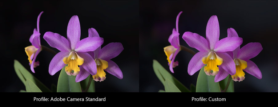
The only difference between these two versions is the camera profile. These subtle yet obvious visual differences in colour are not easily adjusted from one to the other with the standard set of editing tools in Photoshop or the like. The custom profile produces a remarkably similar representation of the real flowers from the get-go with no further adjustments, which I held up next to my Eizo monitor, itself carefully calibrated and profiled, as a sanity check for accuracy. Perhaps even more important than absolute accuracy, the relative colour relationships are well preserved by the custom profile.
I can now routinely achieve highly realistic renderings of these orchid flowers when compared to the actual thing, but only after a significant amount of research and study over a long period of time, making countless mistakes along the way and the investment of quite a bit of money for the necessary tools. I’m pleased by how well it works for me.
Some thoughts about the Fujifilm GFX 100S
As a printmaker who loves revelling simultaneously in exquisite details and large prints, I desired always to have more pixels than my 42MP Sony a7R II could give in a single capture. The simple answer was of course, stitching, but I was already focus stacking these flower pictures. Stitching would add a significant layer of complexity on top of what was already a complex thing.
Consider this. To build an orchid picture, I would usually have to make several dozen exposures, each with the focus subtly changed, going from near to far distance, effectively ‘slicing’ through the scene so that the sliver of depth of field summed across all the captures encompasses everything that I want. It’s not always easy to spot the exact nearest edge to focus on, especially with complex flower shapes and arrangements. The lens I use is fully manual, so I set the aperture manually, and I focus manually. Yes, manually. The a7R II does not have automatic focus bracketing anyway, even if my lens did have autofocus. I turn the barrel of the lens by an angular displacement that is about twice to thrice the width of the period at the end of this sentence, so small is the step change in focus needed. The shutter is triggered, rinse and repeat. Don’t bump the camera, don’t change the lighting. Ensure the flowers are steady and not bobbing or wilting. Remember, I will have repeated this several dozen times for each composition.
The composition itself is often a challenge to figure out. Subtle camera position changes of mere millimeters can ruin the relationships of the three-dimensional structures and how they overlap—or don’t—each other. When stitching, only a portion of the scene will viewable through the camera’s viewfinder at any given time, making these relationships harder to see in totality. I would need about four or five camera angles per stitch, and if each requires say 50 focus-bracketed shots, that’s about 200-250 photos to complete one picture. And about 30-45 mins of capture time. If I made any mistake, I have to repeat the entire thing, which I have done! Painful. And if you think that’s already nuts, add to that the sun cannot change the entire time I’m making a sequence, since I insist on using natural light to illuminate the orchids, because it comes closest to how one is normally expected to see them as they grow in a garden. The alternative excuse is I’m an outdoors landscape photographer and I don’t care to work in studios nor do I have one nor does it make sense to rent a space each time I have to document a new flower.
Enter the amazing 102 million pixels, Fujifilm GFX 43.8 x 32.9mm sensor. In May 2024, Fujifilm announced the GFX 100S II, which released in Singapore in late June, depressing used market prices of the older cameras. I had been seriously considering the original GFX 100S ever since it was released back in Feb 2021, but never could jump for it owing to the $9000 (SGD) brand-new price tag, knowing it would plummet in the near future. Fast forward to today, I was able to purchase a used copy of the GFX 100S for under half of that, still expensive, but oh boy, what a machine!!
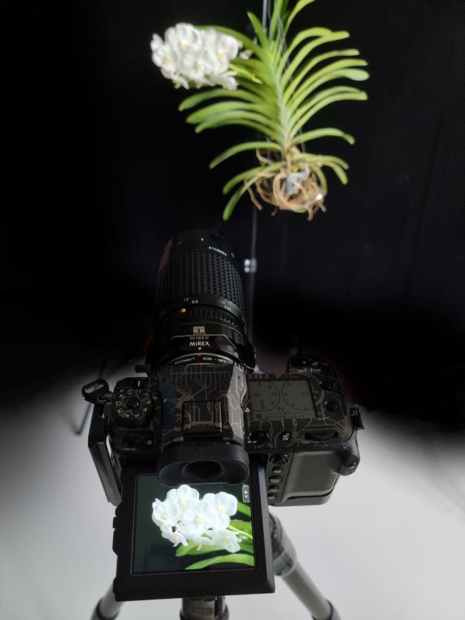
Fujifilm GFX 100S in action, photographing an orchid with the SMC Pentax-A 645 120mm F4 Macro. I’ve since switched from using my Mirex adapter to a brandless dumb one from China that has a much wider throat which I shimmed to under 10 microns of uniform thickness. I still need to fix my Mirex so its throat does not cause internal reflections and ruin pictures, which was what my custom-made baffle was meant to do, but then it made the opening too narrow and resulted in blockage of the image circle for these Pentax 645 lenses. All the images of the rarer types of orchids have been withheld from publishing due to the private nature of the work.
There’s way too much data about these cameras on the internet and I won’t add to the noise. Just a couple of unique insights. I’m glad that the sensor format is 33x44mm, not larger like the Phase One types, because that allows one to adapt medium format film lenses which can still have a good amount of useable movements with a tilt and shift adapter, like the one I have. Building my own custom profiles for the GFX 100S and comparing it to my a7R II proved once again that ‘camera color science’ so many so-called experts tout is simply plain nonsense. Read Ander’s articles and weep.
I’ve set up my GFX 100S in a very particular way to suit the way I like to shoot. The menu and functions are extremely complicated, it took me a while to understand it. Use the touch screen in review mode for way faster scrolling in magnified view, rather than the joystick button. I keep the shooting display pretty minimal, no overlays for focus peaking but highlight blinkies are a must. Get rid of the always-on horizon levelling overlay! Assign it to the AEL button, so it can stand for ‘Auto Electronic Level’ rather than the intended “Auto Exposure Lock” LOL! Oh yes, the focus point position changes when you use magnified live view to where you last left off after scrolling around to check for focus, so if you are using AF, remember that, you won’t be back on the same spot when you exit magnified mode. A step size of 4 is optimal for automatic focus bracketing, but I think you can get away with a step size of 5 to 7. Fujifilm programmed it very nicely that the number of the step size is equal to the implied Circle of Confusion in microns, and hence your choice should basically correspond closely with the pixel pitch of the sensor, independent of lens aperture setting or focal length.
The rear LCD seems pretty colour accurate (I can’t say the same of my 5D II and a7r II), when compared to my Eizo monitor, and is the one I depend on the most. Fujifilm gives you an insane amount of control to adjust it, if you need to. Provia is the most colour accurate film simulation, albeit a little too colourful. You need to pick one. Imaging-resource has done an excellent analysis of the colour accuracy of the different simulations. After a bunch of my own casual testing, I decided to go with PRO Neg. Std. The rendering of reds are not as shifted to orange as much as Provia, and compressed in colourfulness, which I don’t like. ‘Color’ (short for color density, which behaves like saturation) at zero, and the tone curve set to minus 2 for highlights and also for shadows. Provia with ‘Color’ at minus 3 or 4 is also pretty good. Fujifilm does not change the white and black clipping behaviour between simulations as far as I can tell, rather the values are just mapped around differently by different tone curves. PRO Neg. Std has slightly more open shadows than Provia, both are about half a stop lighter in the midtones to highlights than a linear render of the scene, when ‘Highlights’ are set to minus 2. Sharpness -4. Even -3 results in visible but the beginnings of subtle haloing which may make it more challenging when doing critical evaluations in lens tests. Adobe RGB color space, doesn’t affect raw files but makes for slightly more accurate histogram representation and potentially less clipping of the JPEGs. Everything else in the IQ tabs either OFF or zeroed. ‘Dynamic Range’ must be set to DR100. ‘Auto’ is actually DR200 and robs you of a stop of dynamic range, DR400 robs 2 stops!
Joseph Holmes has the best article on the EVF and LCD properties and how to set up file recording which will affect playback magnification. I’ve flipped the dial controls from the defaults for shutter speed and aperture control to match what I have on my Sony. Old habits die hard. I also assigned the top buttons of the camera to adjust the timer setting (it’s the button that sits closer to the timer symbol on the top LCD, how nice, little things like that which make sense help) since I’m always switching between 2-second release (it’s more like 3 seconds, better!) and single shot, and the other top button is to activate the RGB histogram overlay, so I also removed the luminance histogram overlay in live view. Too much clutter otherwise. Quite cool that the camera lets you assign the RGB histogram to a custom button! Use the Q-menu. I put my white balance setting there, because I frequently need to check highlight clipping by activating UNIWB set to Custom 3 (less far away to scroll than Custom 1). Jim Kasson has the best guide to set up UNIWB for your cameras. Oh and the GF 35-70mm kit lens is really great. The most well-behaved zoom I’ve owned to date.
There just one annoying thing about the GFX 100S that is not often talked about. Lloyd Chambers is right about the subtle banding issue that is most easily revealed when photographing blue skies. It seems like a form of PDAF banding? Even when I can’t see it, it still seems to be present, since the pyramids in Helicon’s Method C pick it up when I can’t see anything. It’s pretty gross alright, and I wish it were not present, but I doubt anyone would notice for the most part. Gremlins lurking in the shadows! Yikes!
Horizontal Banding in GFX 100S files seem to be inherent. The right side frame is the visualisation of the pyramids processing done by Helicon Focus, which clearly picked up the banding lines even when nothing was visible in the dark shadows of the original frames, one of which you can see on the left side. How mysterious! The final rendering also does not have any visible banding either. Yet, I see it in a number of blue sky pictures when the contrast is pushed.
It was never my intention to own three camera systems, but now I am in possession of one Canon 5D Mk II, Sony a7R II and the Fujifilm GFX 100S. Entirely unplanned, but these happen to be the three most important milestone cameras in the history of digital photography. Not the absolute best by any means, but they marked key points in the evolution of cameras. The latest one is pretty close to being the best there is! It’s so demanding on the lenses, yet rewarding to good technique and compute resource hungry to process the files!
There’s probably a bunch of other stuff I’ve missed, but that’s about the most important bits for now. So yes, I was immediately curious about the straightness of the sensor relative to the bayonet mount, after the madness of the past. I tested for this soon after I got the camera.
An Even Better Sensor Crookedness Ruler
To cut an already long story a bit shorter, Fujifilm is basically the only mass market manufacturer who has the balls to publish this, I quote them, emphasis mine:
Lastly, let’s talk about something that you will never see on a spec sheet: securing a margin for mass production. Every part of a camera has its tolerance. It needs to be adjusted little by little in the production line to realize the intended performance. A mount’s purpose is to secure the position of the sensor. Its position needs to be adjusted three-dimensionally to realize its full performance.
Fujifilm GFX Technologies #2, 21 Feb 2017
Generally speaking, people often shoot medium format cameras with closed apertures. This is partly because the sensor surface was never accurately positioned. However in the mind of photographers, sometimes they would hope they could shoot F2.8 or F2 on a medium format camera for broader photographic expression.
Technically speaking, the depth of field of F2 light ray is only 10 micron deep front and back of the sensor surface. If the position and angle of the sensor surface is not properly adjusted, then the image will have a partially de-focused area because of its inaccuracy.
G Mount adjusts the sensor’s angle and position in microns. It only allows a few microns in tolerance. With this, we realize a medium format system that can be used with wide open apertures.
That’s quite a claim, certainly something that Canon and Nikon and Sony cannot live up to and never dare to talk about anyway. Roger Cicala has gathered sufficient damning evidence regarding on-axis flange distance variation, here and here, let alone any angular errors. So I had quite high expectations when measuring my GFX 100S, also since my friend Joe Holmes determined his to be straight well under 10 microns. Lo and behold: my GFX has 1.8 microns of swing and 2.8 microns of tilt, +/-2.7 microns margin of error! Essentially perfect!
I owe the increased accuracy of my observation and confidence in the result to the recent development of a new viewing ruler for the test I conduct to measure sensor crookedness.
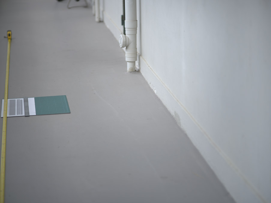
Photographing a tape measure and home-made aliasing ruler pattern for evaluating sensor crookedness
If you’ve read my crooked camera article, you would know how this test should be conducted, but always limited by the difficultly of observing the focus plane. I had an epiphany to make a new ruler pattern which takes advantage of the phenomenon of aliasing to make the region of sharp focus super obvious, especially with the assistance of Photoshop’s Find Edges filter.
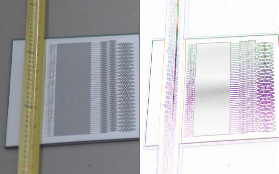
Close-up of tape measure and aliasing ruler pattern. The main part that works very well is constructed of a series of black and white alternating lines like a zebra. The right side image is what I get after I run Photoshop’s Fine Edges on the left side image.
And now it becomes easier to identify the plane of focus which must lie in the middle of the aliased pattern. Notice how narrow the band of dark gray is in the zebra black-and-white alternating lines pattern, compared to the tape measure on the left side, or the siemens stars on the right side? It worked even better than I dared hope!
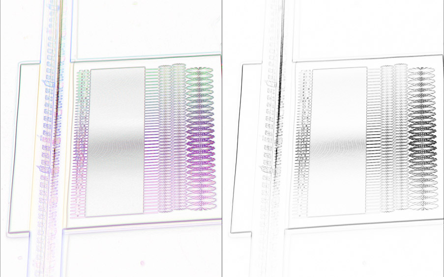
By desaturating the Find Edges result, and increasing contrast using the Curves tool, the region of interest becomes narrower and more prominent, assisting the guesswork!
All these and many other successions of successes both small and large have contributed to highly satisfying results in the image making process for these orchids.
Samuel Chia
28 Aug 2024
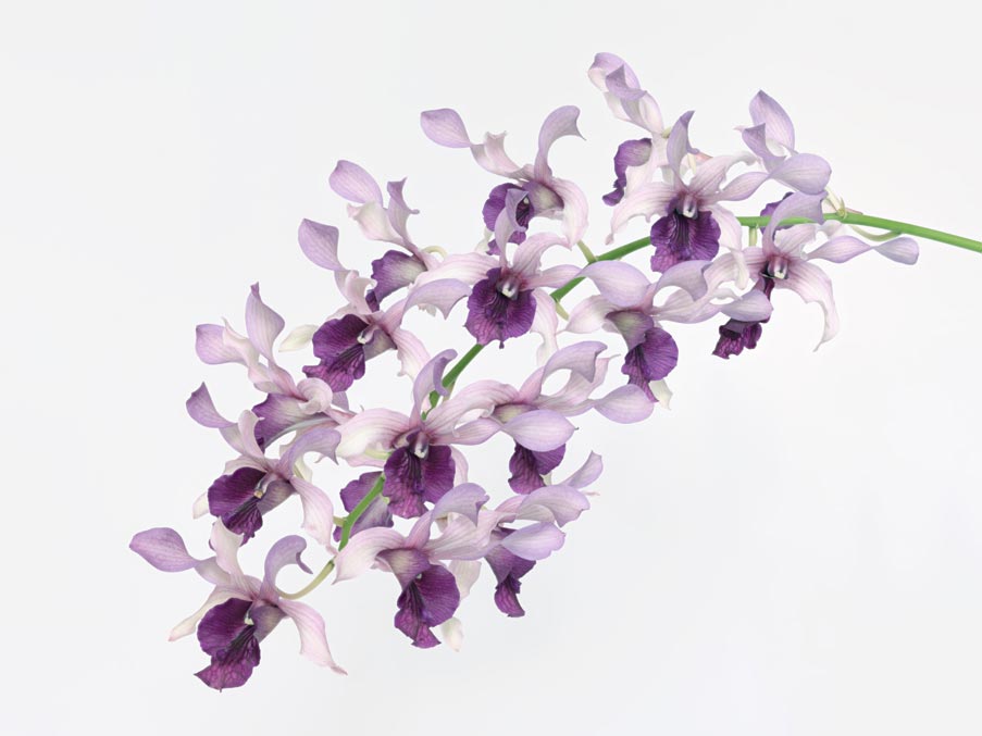
Dendrobium Serene Chang, light variant, single spray on white, 2023
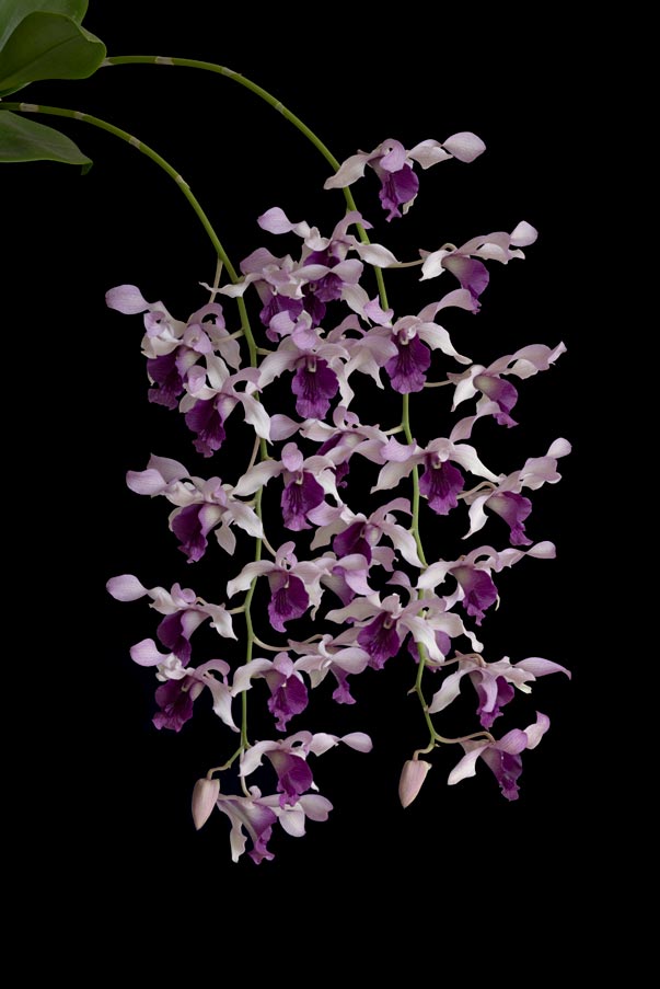
Dendrobium Serene Chang, light variant, two sprays on black, 2024
Comments are Disabled